Two CMS finalists, evaluated in context.
A working evaluation of two CMS platforms, run against pages built in a visual direction we're proposing for ICSC. The platform decision and the design direction inform each other — running them in parallel surfaces trade-offs that a feature comparison can't.
The sandboxes are purpose-built rather than vendor-provided. Vendor demos show what a platform can do at its best; a sandbox with ICSC's actual content model, component library, and design tokens underneath shows what authoring feels like once the platform sits inside a real foundation. Tokens, components, and tooling carry as much weight in the final result as the CMS itself.
Three perspectives on a modern ICSC.
Built from the same core brand identity, each visual direction explores a different expression of the ICSC experience through unique approaches to typography, layout, motion, and visual hierarchy. While grounded in established brand elements, we've intentionally explored opportunities to modernize the experience—introducing selective departures, particularly in typography and supporting iconography, to improve readability, usability, and overall digital expression. Direction A has been extended into the live page samples below.
These concepts are designed for ICSC's content and audiences, and are intended to function as complete systems rather than individual page designs. One direction has been extended into the live pages below.
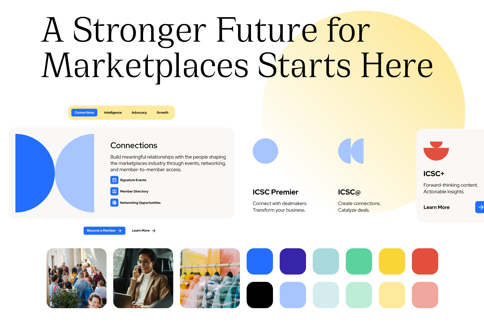
Bright & Connected
A lighter, more approachable expression of the ICSC brand that emphasizes openness, accessibility, and community. Aura gradients, expanded use of secondary colors, and circular brand-inspired motifs create a sense of energy and momentum, while refined typography and subtle motion introduce a more refined digital experience.
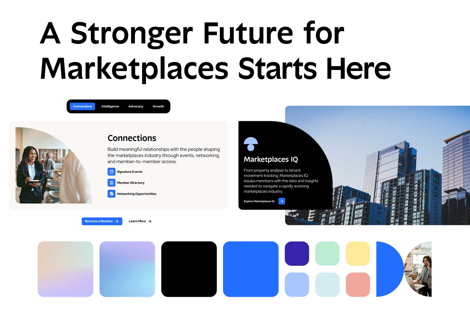
Confident & Focused
A streamlined visual approach that sharpens the brand through strong typography, disciplined color usage, and prominent imagery. By pairing strong layouts with imagery reflecting the marketplaces industry, this direction feels authoritative, professional, and highly actionable.
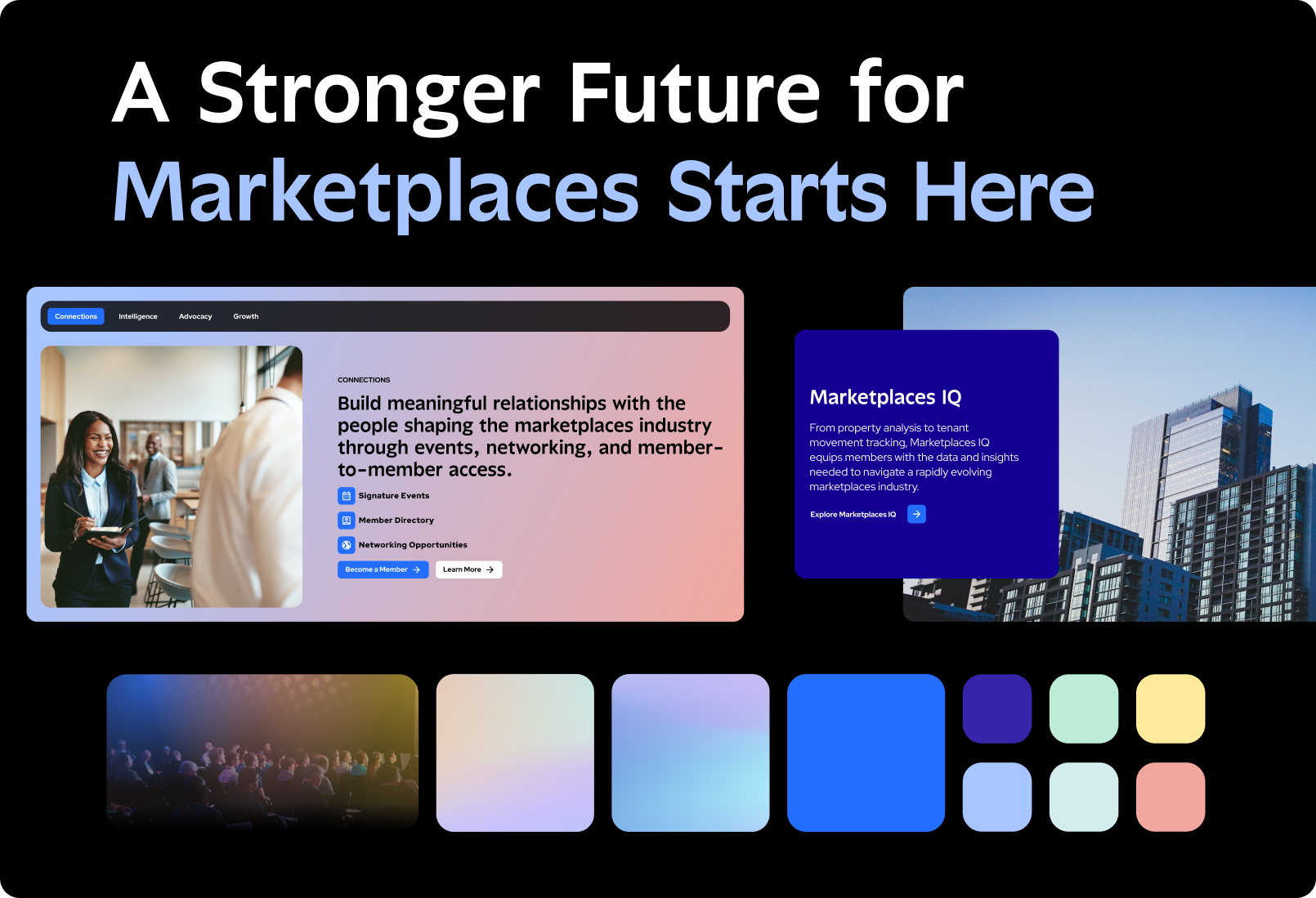
Bold & Dynamic
A high-impact interpretation that uses dark surfaces, immersive gradients, and vibrant contrast to create a more dramatic digital presence. Rich motion opportunities and expressive visual treatments position ICSC as a forward-looking organization while maintaining a strong connection to the established brand system.
Direction A, brought to life in working pages.
The following pages extend Direction A beyond static designs and into a fully interactive experience. Together, they demonstrate how the visual language, components, and interaction patterns work across key moments of the ICSC digital ecosystem.
Marketplace homepage.
The full editorial top-of-funnel: hero, pillars, event types, market intelligence, public policy, professional development, membership.
ICSC+PROPTECH 2026.
Hero with date / location / CTAs, stat band, agenda, speakers, sponsors, member-only states — the recurring shape every signature event reuses.
About ICSC.
The content library at work: PageHero, StatBand, PullQuote, ProgramCard, Timeline, TeamGrid, NewsCard, CTAPanel composed into a tier-1 narrative page.
The same pages, rebuilt in each platform.
Each finalist runs against the same content model, component library, and design tokens. Raters work through the task battery in each sandbox and score on identical criteria. Access is limited to approved evaluators while the evaluation is in progress.
Enter your email to access the sandboxes.
The authoring environments are shared with approved evaluators only. Enter the email you were invited with to unlock your sandbox.
Scored on two dimensions, kept separate.
D1 — Operational Excellence: how efficiently marketers handle recurring work (editing, scheduling, translation, SEO, approvals, asset management). D2 — Organizational Independence: what marketing can accomplish without dev help when the pre-modeled scope is exceeded. A platform that wins D1 and loses D2 has a different forward profile than one that ties on both — even if the average is identical.
What sits underneath both sandboxes.
Both finalists render from the same component library and token set. The CMS varies; the design system stays constant — which is what makes the evaluation a measurement of the CMS rather than the surface.
Three-layer token library.
Primitive → semantic → component. Colors, type, spacing, radii, shadows, motion — rendered from the same source the app consumes.
Every shared component, in isolation.
The canonical reference for what marketers can compose pages from. Both sandboxes draw from this same library.